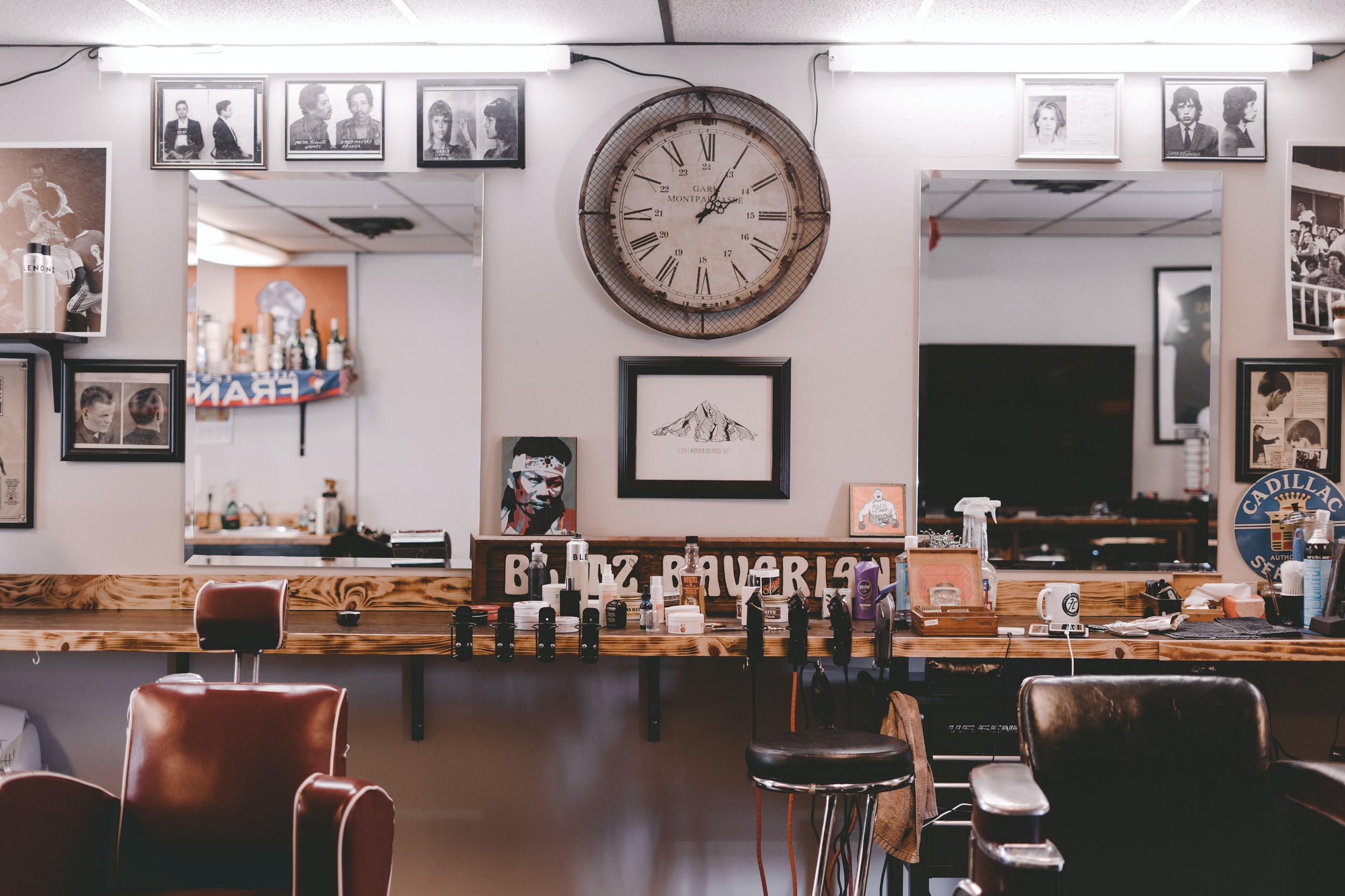
comradery.
To give that barbershop feel.
getting things just right
alternative idea.
While this design is both masculine and can be easily made into a neon sign, there are some issues. Overall, the client prefers the emblem-like logo presented in the scissor’s logo. He feels this logo doesn’t have that “WOW” factor and isn’t very memorable. All in all, the client preferred the scissors logo.
final design.
This was the client’s favourite design idea, it just needed perfection. It was good for a lot of reasons. The main reason was that it could easily put into a neon sign like the client requested. It was also masculine and featured “OB” like requested. It was a very creative design and distinct, it fit the market and business well.
A Mock Up of the neon sign that the client
asked for specifically.
“You're only as good as your last haircut.”
Fran Lebowitz
“A big business
starts small.”
CONTACT


